Struggling to Integrate Qual & Quant Data? Master Joint Displays
The Purpose of Visual Integration Tools
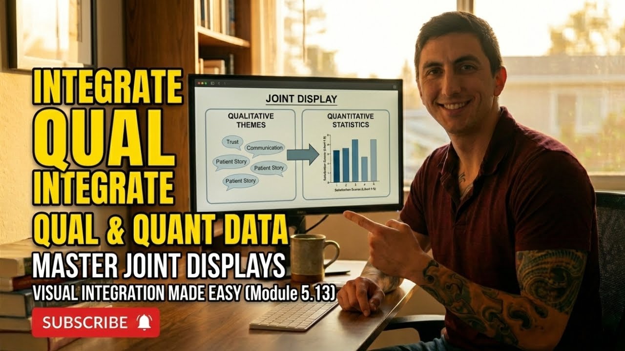
One of the persistent challenges in mixed methods research is making integration visible rather than merely claiming it occurred. Joint displays address this challenge by providing a structured visual format that presents quantitative and qualitative findings together in a single table, matrix, or figure. When done well, a joint display allows readers to see the integration rather than having to infer it from the narrative.
The value of joint displays extends beyond communication. The process of creating one forces the researcher to think carefully about how the two data strands relate. Constructing columns for quantitative results and qualitative themes and then mapping connections between them is itself an analytical act that can reveal patterns and discrepancies the researcher might otherwise overlook.
In healthcare research, where findings must reach audiences ranging from biostatisticians to community health workers, joint displays serve as a universal translation mechanism. A clinician who skips the statistical methods section might study a joint display closely, and a methodologist who finds qualitative narratives hard to evaluate might appreciate seeing themes anchored to numerical results.
Common Types of Joint Displays
Several joint display formats have become standard in mixed methods research. Side-by-side comparison displays place quantitative results in one column and corresponding qualitative themes in an adjacent column, with a third column noting whether the findings converge, diverge, or complement each other. This format is straightforward and works well for convergent parallel designs.
Statistics-by-themes displays organize the table around qualitative themes and then attach relevant quantitative statistics to each theme. This format is useful when the qualitative strand drives the analysis and the quantitative data provide supportive evidence. Case-ordered displays arrange participants or cases in rows, ranked by a quantitative variable, and then layer qualitative data alongside to show how experiences differ across the quantitative spectrum.
Instrument development displays are specific to exploratory sequential designs. They show how qualitative codes or themes were translated into survey items, providing a transparent audit trail from open-ended data to structured measurement. Each format serves a different analytical purpose, and the choice should be guided by the study design and the specific integration question being addressed.
Designing an Effective Joint Display
Clarity is the most important quality of any joint display. The reader should be able to grasp the integrative message within a few moments of examining the table. This requires careful attention to labeling, formatting, and the selection of representative data. Avoid cramming too much information into a single display; if the data are complex, consider creating multiple displays that each address a specific aspect of the integration.
Balance is also essential. The quantitative and qualitative columns should receive roughly equal visual space and analytical depth. A display that features elaborate statistical results alongside a single vague quote does not represent genuine integration. Select illustrative quotes that are specific, vivid, and directly relevant to the quantitative finding they accompany.
Structure the display around the research questions or key constructs rather than around arbitrary categories. Each row or section should address a specific aspect of the research problem, making it easy for readers to follow the integrative logic from left to right across the columns. Adding a brief narrative summary below the display can help readers who are unfamiliar with the format understand how to interpret what they see.
Using Joint Displays to Strengthen Your Manuscript
Including a joint display in a manuscript signals methodological sophistication and provides concrete evidence that integration occurred. Many peer reviewers specifically look for visual integration tools when evaluating mixed methods submissions, and their presence can strengthen the overall assessment of study quality.
Position the joint display in the results section, ideally at the point where the two strands are first brought together. Reference the display explicitly in the text, walking readers through the key patterns it reveals. Do not assume that the display speaks for itself; the accompanying narrative should highlight the most important convergences, divergences, and complementarities.
Joint displays can also be valuable in presentations, reports to funders, and community stakeholder meetings. Adapting the format for different audiences might involve simplifying the statistical notation, selecting more accessible quotes, or adding explanatory footnotes. The underlying principle remains the same: making the integration visible and comprehensible so that the unique contribution of the mixed methods approach is unmistakable.
Frequently Asked Questions
Are joint displays required in mixed methods research?
They are not strictly required, but they are strongly recommended because they make integration visible. Many reviewers and editors consider them best practice, and their inclusion often strengthens a manuscript's evaluation.
Which joint display format should I use for a convergent parallel design?
A side-by-side comparison display works well because it mirrors the design's logic of collecting two strands independently and then merging them. The convergence, divergence, or complementarity column makes the integration explicit.
How many quotes should I include in a joint display?
One to three illustrative quotes per theme or construct is typically sufficient. Choose quotes that are concise, vivid, and directly relevant to the quantitative finding they accompany. Too many quotes clutter the display and reduce clarity.
Can I use a joint display in a dissertation defense presentation?
Absolutely. Joint displays are highly effective in oral presentations because they give the audience a visual anchor for understanding how the two strands relate. Committee members often appreciate the clarity and transparency they provide.
What software can I use to create joint displays?
Standard tools like Microsoft Word, Excel, or PowerPoint can create effective joint displays. Specialized qualitative analysis software like MAXQDA also offers built-in joint display features that automate some of the formatting work.
Explore more study tools and resources at subthesis.com.